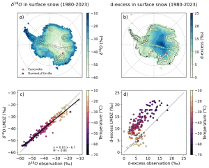
Les isotopes stables de l’eau antarctique dans le modèle atmosphérique global LMDZ6 : de la climatologie aux processus de la couche limite 8 juillet 2025
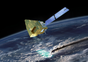
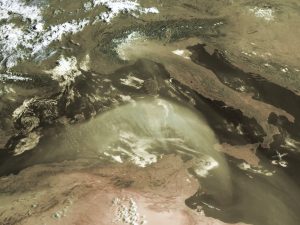
L’empreinte du changement climatique sur les inondations au Portugal et les tempêtes de poussière saharienne en mars 2024 30 juin 2025
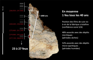
Des traces de suie préservées dans un spéléothème témoignent du contrôle du feu par les hominidés il y a 270 000 ans, dans la vallée du Rhone 30 juin 2025
Protéger les forêts qui repoussent naturellement : une solution climatique cruciale – et négligée 26 juin 2025
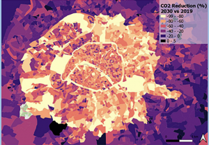
Objectifs climatiques de Paris : une cartographie précise des inégalités et les leviers d’action en région parisienne 3 juin 2025
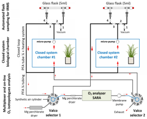
Système de multiplexage pour quantifier les facteurs de fractionnement de l’oxygène dans des chambres biologiques fermées 3 juin 2025
Méthodes pour confronter spatialement les données socio-économiques avec des données d’assainissement : exemple à Paris 3 juin 2025
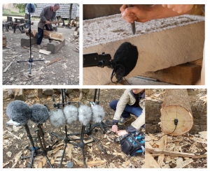
Séminaire de Mylène Pardoen – « Sensorialité et Histoire : écouter et donner à écouter ! » 28 mai 2025
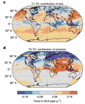
Le méthane sous surveillance : des chercheurs du LSCE (CEA,CNRS, UVSQ) décryptent les évolutions saisonnières de ce puissant gaz à effet de serre 19 mai 2025